Where Is the Market Headed: Double Bottom? Triple Top?
Double bottom? From a technical standpoint, the current environment may have been viewed as either bullish or bearish. Those on the bull side of the equation took heart in a technical indicator known as the double bottom. The double bottom reversal is a bullish reversal pattern that traders use to anticipate possible upside movements. As its […]
Sept. 8 2016, Published 12:16 p.m. ET

Double bottom?
From a technical standpoint, the current environment may have been viewed as either bullish or bearish. Those on the bull side of the equation took heart in a technical indicator known as the double bottom. The double bottom reversal is a bullish reversal pattern that traders use to anticipate possible upside movements.
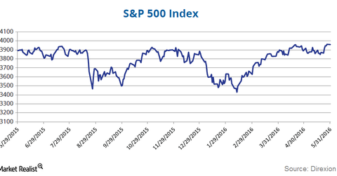
As its name implies, the pattern is made up of two consecutive troughs that are roughly equal, with a moderate peak in-between. A double bottom looks like the letter “W.” It usually features a more severe correction but no more than a 50% drop from its peak. The middle peak in that W-like structure should also be in the upper half of the base. US large cap performance since May 2015 has formed a classic double-bottom pattern through the past 13 months and counting.
Triple top?
Of course, markets by definition are places of opposite opinions. In the first quarter of the year, stocks were in full retreat and very few investors thought we would be rapidly approaching all-time highs for the S&P only a few months later. Some investors see another technical indicator, this triple top chart for the S&P 500, with its ominous, looming peak and may conclude that US stocks are long overdue for a correction. What will be the catalyst for the next bear market?
Market Realist
There are various other reasons for all the growing disquiet among investors, and primary among them are rich valuations.
The corporate earnings profile for the S&P 500 continues to look anemic. However, the S&P 500 continues to show a forward price-to-earnings ratio that is near its 14-year high. The graph above shows Robert Shiller’s CAPE (cyclically adjusted price-to-earnings) ratio for the S&P 500 (SPUU)(VTI). The ratio currently hovers around ~26x, which is as high as the ratio ever got before the 2007–2008 US financial crisis (XLF).
According to FactSet, the blended earnings decline for the S&P 500 in 2Q16 is estimated to be -3.2%. In fact, 2Q16 marks the first time that S&P 500 has recorded five consecutive quarters of year-over-year declines in earnings since the 3Q08–3Q09 period.
Despite the underwhelming corporate earnings outlook, valuations seem to be high. The graph above shows the 12-month forward price-to-equity multiples of the S&P 500 (SPDN) (VOO) by sector. Most sectors show a ratio higher than their historical averages.
And the upcoming US elections are yet another source of jitters for investors.
In any case, although a bear market may not be on the immediate horizon, investors should definitely explore ways to keep their portfolios protected from uncertainties and risks.
We’ll explore the need for hedging and different strategies in subsequent parts of this series.
