The yield curve: An indicator of the monetary policy implications
Intelligent investors have an opportunity to earn profits and avoid losses, if they understand how the yield curve may move when the Fed acts.
March 14 2014, Updated 6:53 a.m. ET

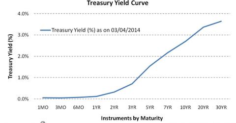
The yield curve is a line that plots the yields or interest rates (at a given point in time) of bonds having equal credit quality, but differing maturity dates.
As can be seen in the chart above, the curve shows several yields or interest rates across different contract lengths (one month, three months, one year, five years, 30 year, etc.) for a similar debt contract. It is used as a benchmark for other debt in the market, and is also used to predict changes in economic growth.
Various exchange-traded funds (or ETFs) track the performance of the U.S. Treasury securities with varying maturities. For example, the iShares Barclays 1-3 Year Treasury Bond Fund (SHY) and the iShares Barclays 20 Year Treasury Bond Fund (TLT) track the performance of short-term and long-term U.S. Treasury securities, respectively. The returns from these ETFs vary with the returns of the underlying Treasury securities. Accordingly, TLT has a YTD yield of 4.38% vis-à-vis SHY which delivers a YTD yield of 0.08%. Likewise, sector ETF returns are affected by the performance of its sector. For example, the State Street Energy Select Sector SPDR Fund (XLE), which tracks stocks of the energy sector like Exxon Mobil Corporation (XOM) and Chevron (CVX), has a YTD of -1.53% owing to the poor state of energy sector.
The yield curve’s signaling ability
The shape of the yield curve is what gives the investor an idea of future interest rate changes and economic activity. The shape of the yield curve can be normal (upward sloping), inverted (or downward sloping), or flat.
Normal curve
A normal curve signals economic growth. A yield normal curve, that is, when yields rise as maturity lengthens, reflects investor expectations for the economy to grow in the future and, importantly, for this growth to be associated with a greater expectation that inflation will rise in the future rather than fall.
Steep yield curve
A steep yield curve gives bullish signals to stock investors. This type of curve can be seen at the beginning of an economic expansion (or after the end of a recession). Here, economic stagnation will have depressed short-term interest rates; however, rates begin to rise once the demand for capital is re-established by growing economic activity.
Flat or humped yield curve
A flat or humped yield curve gives moderate bear signals. A flat yield curve is observed when all maturities have similar yields, whereas a humped curve results when short-term and long-term yields are equal and medium-term yields are higher than those of the short-term and long-term. A flat curve sends signals of uncertainty in the economy. This mixed signal can lead to a normal curve or may later result into an inverted curve.
Inverted (or negative) yield curve
An inverted (or negative) yield curve means strong bear signals. Normally, it’s caused by the Federal Reserve raising short-term interest rates to slow the economy. Investors contribute by driving long-term yields down, switching out of equities into more secure investments. Negative yield curves have proved to be reliable predictors of future recessions.
So, the Fed, through its monetary policy, and the market, which is based on investor expectations, are the two main driving forces that act and react to cause changes in the shape of the yield curve.
Intelligent investors have an opportunity to earn profits and avoid losses, if they understands how the yield curve may move when the Fed acts. The next part of this series reflects on how the changes in the Fed’s policy affect the yield curve.
